Sections
Popular watch types
Popular features
Popular materials
Sections
Popular watch types
Popular features
Popular materials
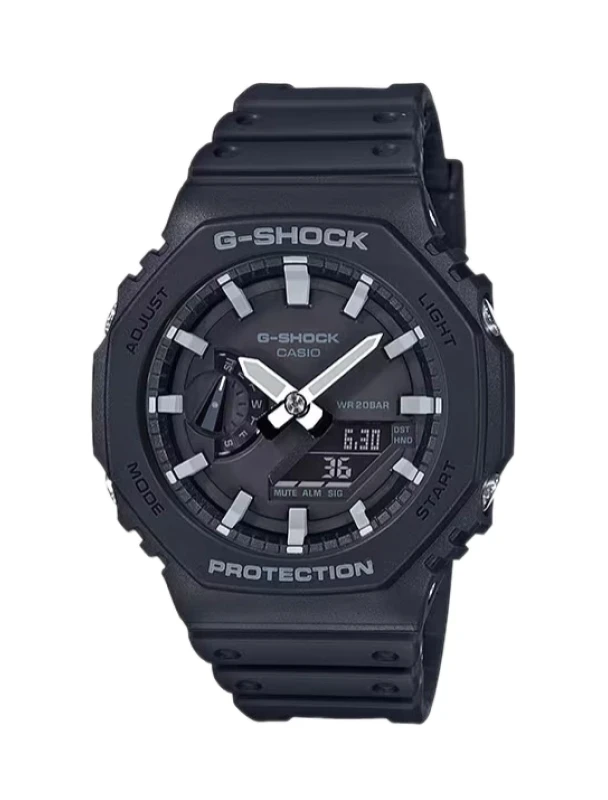
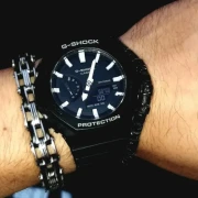
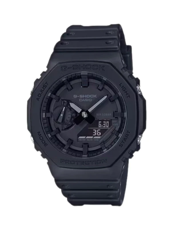
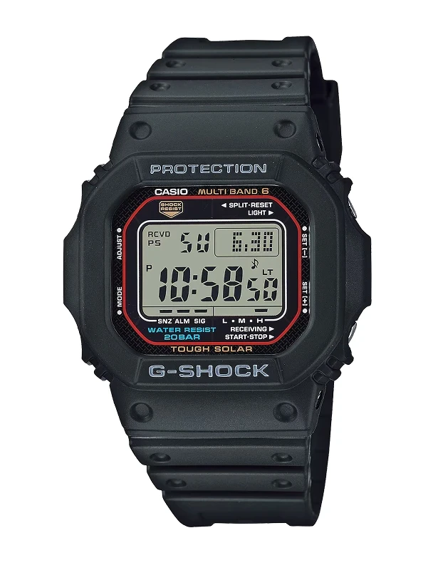
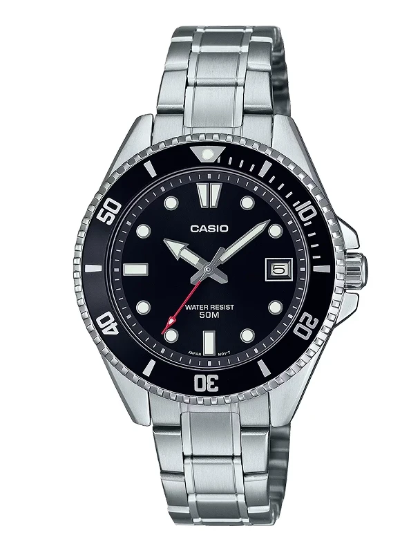
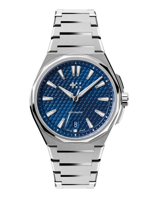
Reference: GA-2100-1A (2020) | Black dial on a resin strap
Personalized recommendations (coming soon)
Get recommendations based on your tastes
Discover cool watches and underdogs
Not all great watches get the attention they deserve
Keep track of your wish list and watches you like
And the full collection for that matter
Use your expertise to help others
All of us would like to hear from actual owners
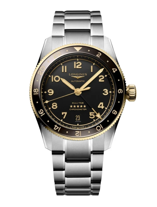
Based on owner votes this watch fits best on wrists sized between 6.5in - 6.5in (16.5cm - 16.5cm).
We may earn a commission when you buy through some of these links.
I have a long relationship with Casio watches. My first ever watch was a blue crystal Baby-G that I loved to death, until the strap failed while jumping off a wharf into the ocean and I could only watch as my beloved Baby-G slowly sank to the bottom of the pacific icean, never to be seen again. My next watch was a G-shock that I kept for many years until the band failed (after being hit with a cricket bat, to be fair) and unable to find a replacement band it got resigned to the back of the desk drawer.
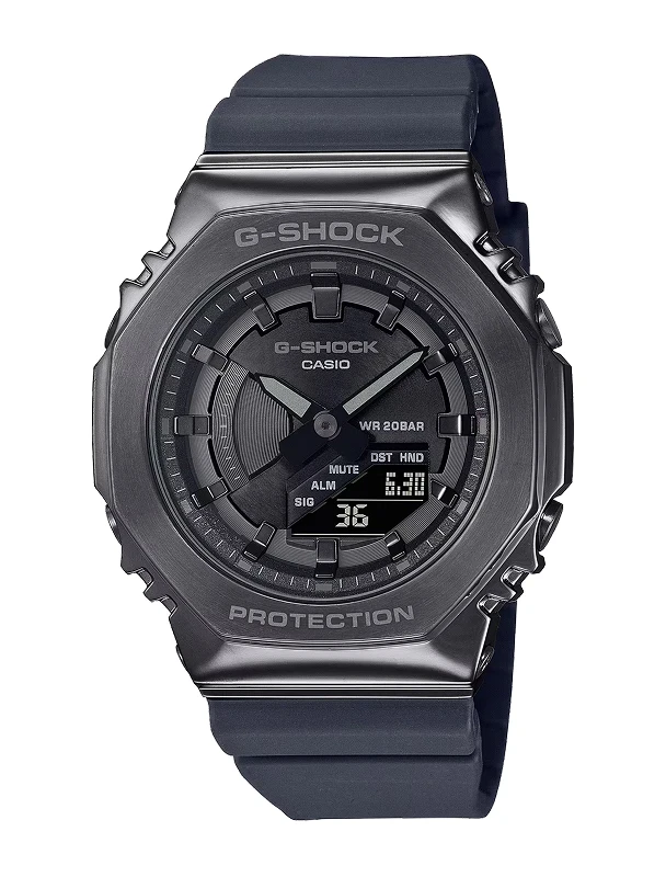
When I got into watch collecting proper, I knew I just had to have a Casio in the collection as the designated "beater." It is through this lens I went shopping and through this lens I will be reviewing this watch. I settled on the G2100 "CasiOak," nicknamed after the octagonal bezel that more than closely resembles a certain high horology sport watch... The first casio in some time to reach hype watch status, the CasiOak is a sturdy but imperfect watch.
The pros: in this blacked out version, it looks menacing. Black goes with everything, and I've taken it to some pretty rough places without concern. Currently it is my watch of choice for white water kayaking, which involves regular close calls with rocks, some high pressure icy water, and generally getting bashed about. It handles all this with no trouble at all.
The cons: legibility. As many have said before me, the digital module on this design is small and hard to read, and is often covered up by the handset. So although the module features a stopwatch, world timer and alarm function, I don't find myself being inspired to use them. The lume on the analog hands is also a tokenism at best, fading faster than cheap vinyl left out in the summer sun. The black on black also isnt the best for analog legibility, but there are a million and one other colourways that address that particular concern.
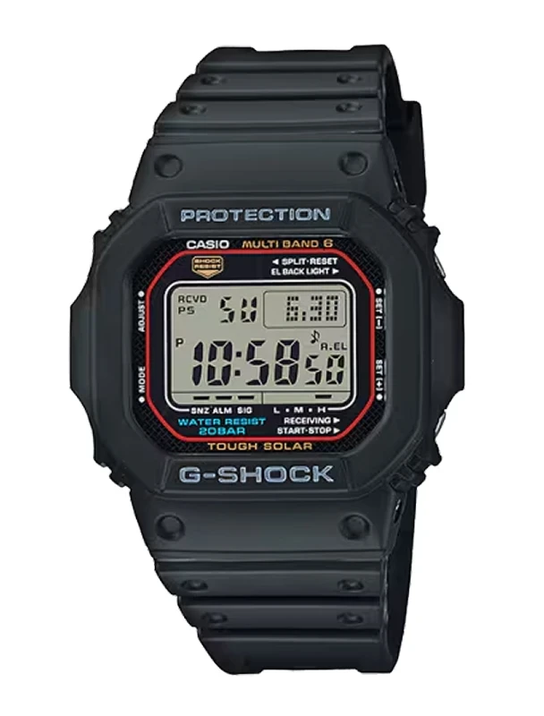
If I was going to recommend a watch for the pure G shock experience to a first timer or for a one watch collection, I'm not sure I would dorect them to the GA2100. The 5600 series are a much better starting point, with better legibility from the digital screen and similar top notch wearability. But, if you're like me and just love the angular design, anidigi layout and are willing to accept some compromise in functionality in return, it lives up to the hype status.
The Casioak. The only hype watch I have ever purchased. I have let it go since, and there is one main reason for that besides just getting bored of it long term, which happened also.
The digital subdial. Completely inadequate, useless, disappointing, frustrating and other matching phrases to continue.
The problem with the digital screen is legibility. You can barely see it with young, healthy eyes; forget about reading it properly once you're in the age where eyesight starts to lose its youthful strength.
The fact that the hands completely cover up the screen several times a day is just the last nail to the coffin, or to be a little bit more positive, the chef's kiss, the cherry on top, the last straw and other matching phrases to continue.
It took me a longer-than-usual time to sell the watch tho, because I quite liked it and I still think it looks amazing.
It's big, but it wears G-Shock big, which is always fine. It is comfortable on the resin strap, lightweight of course, and as I always had a thing for monochrome black watch dials, well, I have fallen in deep with my Casioak, and felt bad for selling it.
I bought the watch to be a gym watch, and in the gym I am in dire need of the stopwatch and countdown timer, as I must know to the exact second how much time I wasted scrolling on my phone while keeping one of the busy machines from being used by others, so the small, unreadable screen was a dealbreaker.
As for the Royal Oak resemblance, frankly, I didn't care much about that. I don't really see that in the design, maybe if I really squint my eyes I can see something that resembles an Offshore, but really, they are speaking a completely different design language, and I think that is for the best.
I have the full-black version and it looks like it means business. Joking aside it's a great stealthy-looking sports watch. Also, I got the watch as a gift from my wife so if you are looking to gift this, yeah, go ahead, I think any watch lover would love it in the collection.
The size is perfect for me, it doesn’t look chunky even though it's quite large and the band goes quite sharply downwards and not extending the effective “lug to lug” which helps a lot for smallish wrists.
The build quality is where I have some issues with it. After about 3 years of semi-regular wear, the outer shell has started to warp and get a bit loose. It's not as tight around the watch head as it was when new.
This is something that happened with an older G-Shock that I have as well. I’m not sure how common this issue is but it's something I noticed. The watch still holds together very well so it's not falling apart or anything but it is quite annoying.
Another issue I have with the watch is the lack of lume on the hour makers. I think it would have helped with legibility. Sure there is the usual G-Shock LED light but since there is some lume on the hands why not add on the markers as well?
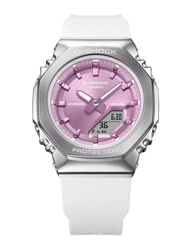
Some anti-reflective coating would have been nice since at least in the full black version the dial is quite hard to see if light hits the dial. On other color options, it doesn't seem to be as bad. My wife’s GMA in the pink color scheme doesn’t have this issue.
Even though I mostly complained about the watch here, I still think it's a great watch for the money and also there are quite a few mod kits out there to change the look of it, cases, bracelets, and whatnot if you are into modding.