Sections
Popular watch types
Popular features
Popular materials
Around the web:
Budget watch collector always on the hunt for pre owned bargains.
Seiko 5 Sports SKX GMT 42.5mm
by Urszuly Patrik
Hamilton Khaki Field Mechanical 38mm
Hamilton Khaki Field King Auto 40mm
Christopher Ward The Twelve 38mm
by Andrei
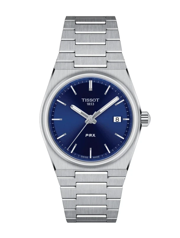
Tissot PRX 35mm
by alex
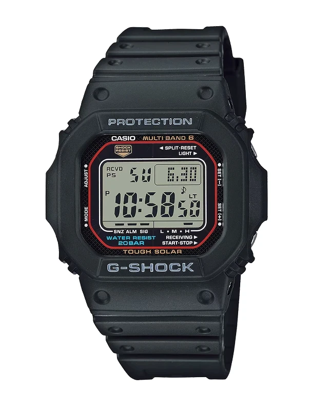
Casio G-Shock GW-M5610U 43.2mm
by Tafline
by Robin Page
Hamilton Khaki Field Murph 38mm
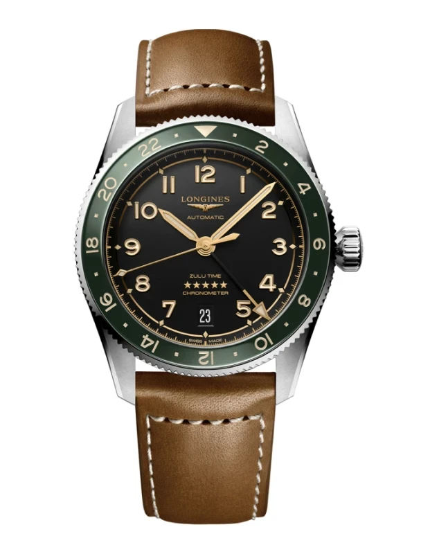
Longines Spirit Zulu Time 39mm
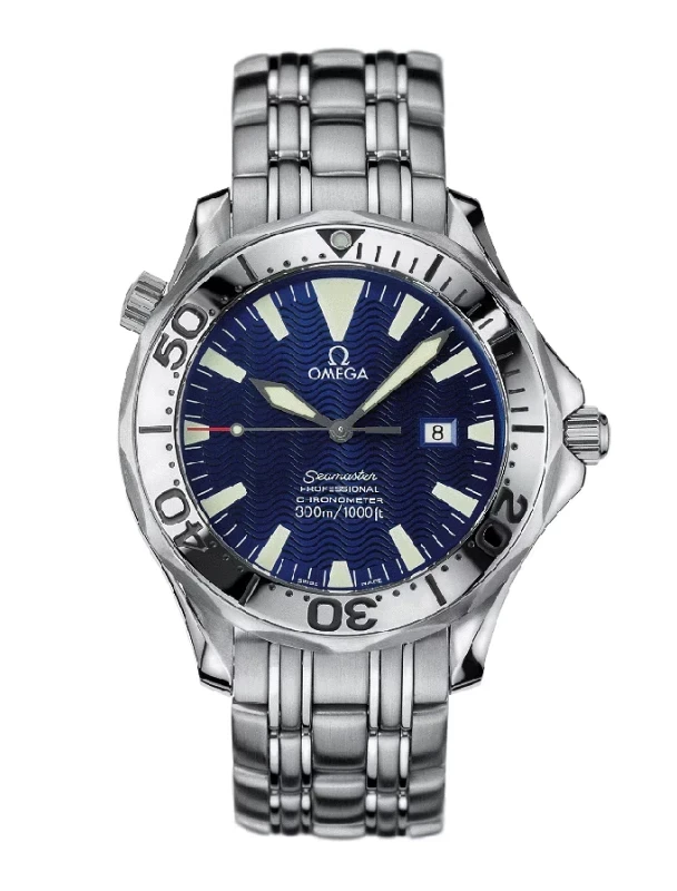
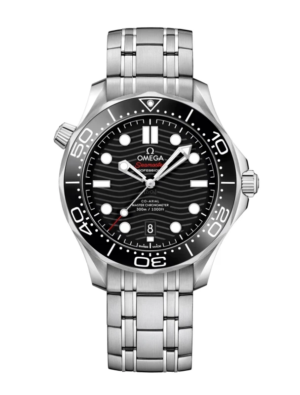
Omega Seamaster Diver 300m Date 42mm
by Tanner Cortez
Don't have an account? Sign up, it's quick and easy!
Forgot your password?